Project overview
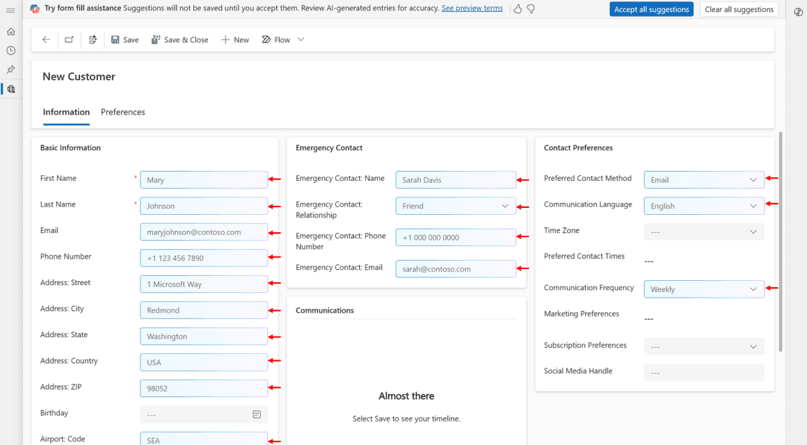
Treasora is an AI-supported budgeting and workflow tool for government emergency management, designed to help users create, review, and approve mission assignments, cost estimates, and transactions more efficiently.
We partnered with PFF to explore this new system for supporting related finance teams through complex tasks.
Domain
AI Workflow
B2B SaaS
Web & mobile design
Financial Operations
Intro & research

PFF helps nonprofits, government agencies, and small organizations manage emergency financial planning and budgeting.
The work itself is time-sensitive, compliance-heavy, and often fragmented across complex systems.
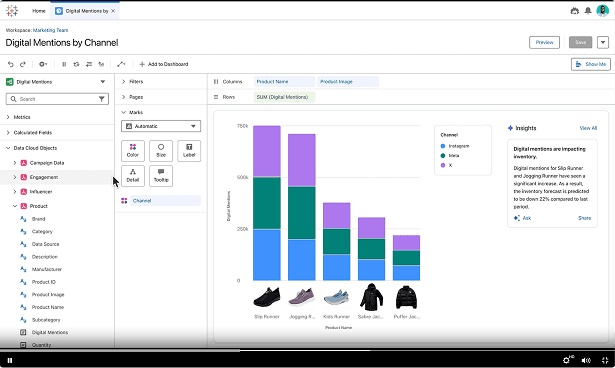
Picture from reference system - InCEP
Building product understanding
through multiple research inputs & outputs
Internal documents
Understand the current state and planned direction
Competitive analysis
Review the gap and the trend, find new opportunities
Client conversations
Clarify the core requirement and align product details
InCEP review
Walkthrough the system and understand basic flow
Information architecture
Which workflows mattered most
Persona
Who we were designing for
User stories
What the MVP should prioritize
Challenges & strategies
4 Key challenges
Through client conversations and current system walkthroughs, I realized the core challenge was not just improving the interface. PFF needed a clearer product direction for a complex emergency finance workflow.
Fragmented workflows
Users needed to move across multiple modules and screens to complete financial tasks.
Heavy terminology
Terms like MA, CE and spend plan lines created friction for new or less technical users.
Unclear AI role
AI support direction was vague, no clarity about how to incorporate AI
Expanding MVP scope
Client conversations often introduced new feature ideas, making prioritization difficult.
How to make complex workflows
easier to navigate?
To solve the uncovered challenges,
I focused the design strategy on making complex financial workflows easier to navigate, review, and act on with confidence.
01
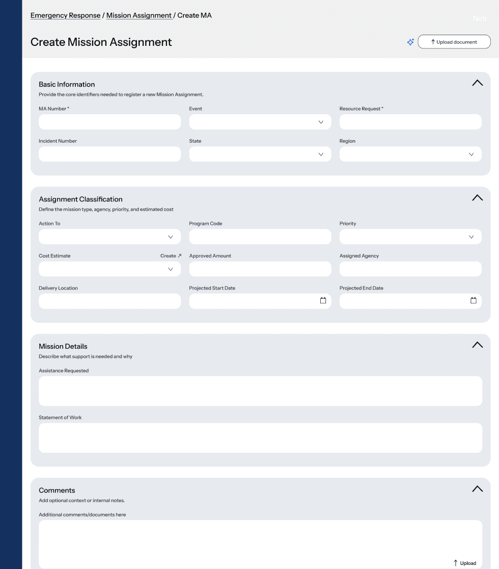
Guided task entry
Quickly start key workflows without searching across modules
02
Structured forms
Break complex financial tasks into clear, step-by-step sections
03
AI review support
Bring Al insights and approval summary into one review context
04
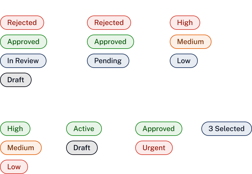
Consistent feedback
Use inline feedback to make system responses clear
Key feature design
FFEATURE1/
AI interaction
STEP1/Exploration
One of th key features was AI supporting workflow. Original product did not embedded with AI feature, I reviewed similar products and patterns to identify where it could support users:
Key data support
Review support
Chatbot


STEP2/Design & iteration
Explore diverse design pathways of AI assistant
Summary Banner
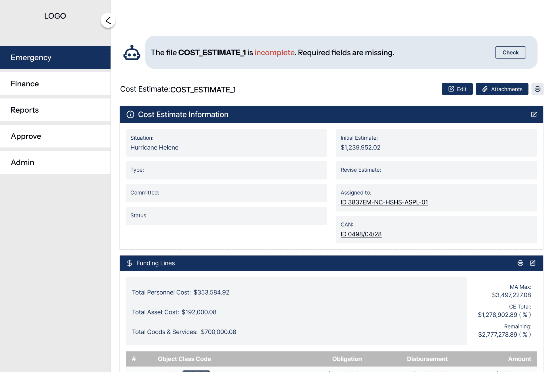
Quickly tells users the key issue or conclusion;
Lightweight and less disruptive
Need a clearer action if users want more detail
Entry Icon
Creates a clear AI feature presence
Unclear what users will get after clicking the button
Inline Autofill

Auto-fill from similar MA
Useful for repetitive financial inputs
Higher trust risk; users may not understand the source
Usability test
Users need an AI assistant
that’s simple and easy to understand


V1 Clearer layout
Provided users with a quick, readable conclusion at the right moment while keeping the main form experience focused.

V2 A smoother interaction
Reduced the visual interruption from the dark overlay, easier to check content
Added a “View Findings” entry point, connect findings with key information
Other features


FEATURE2/
Reducing manual judgment
in complex forms
Speed up and reduce manual decision-making
Increase trust by making AI suggestions more transparent and reviewable
FEATURE3/
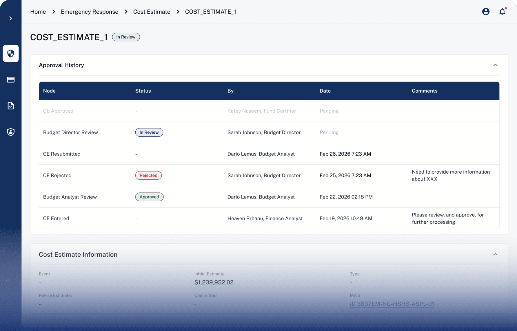
Making submission
progress visible
Provide users with a clear view of submission status
Easier to review past actions and decision records

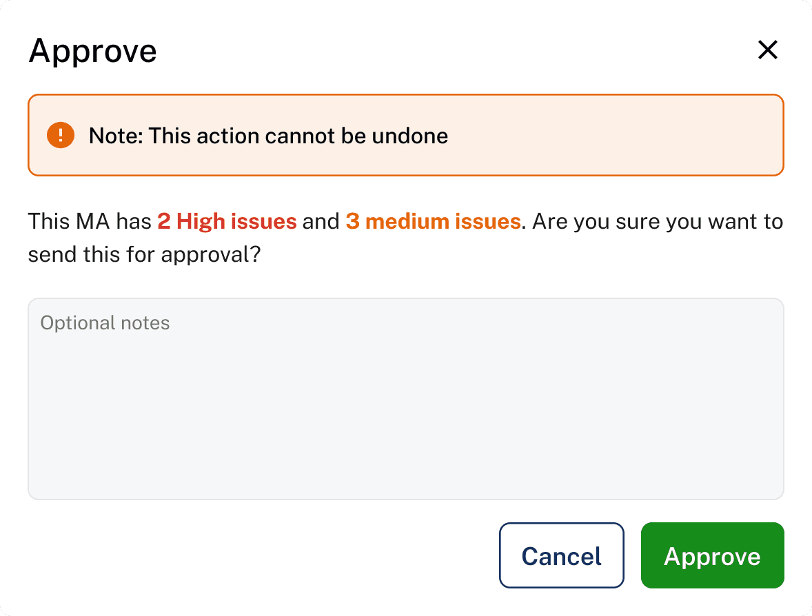
FEATURE4/
Reducing uncertainty
after key actions
Show immediate feedback after saving, submitting, approving, or rejecting, so users always know whether the action was successful.
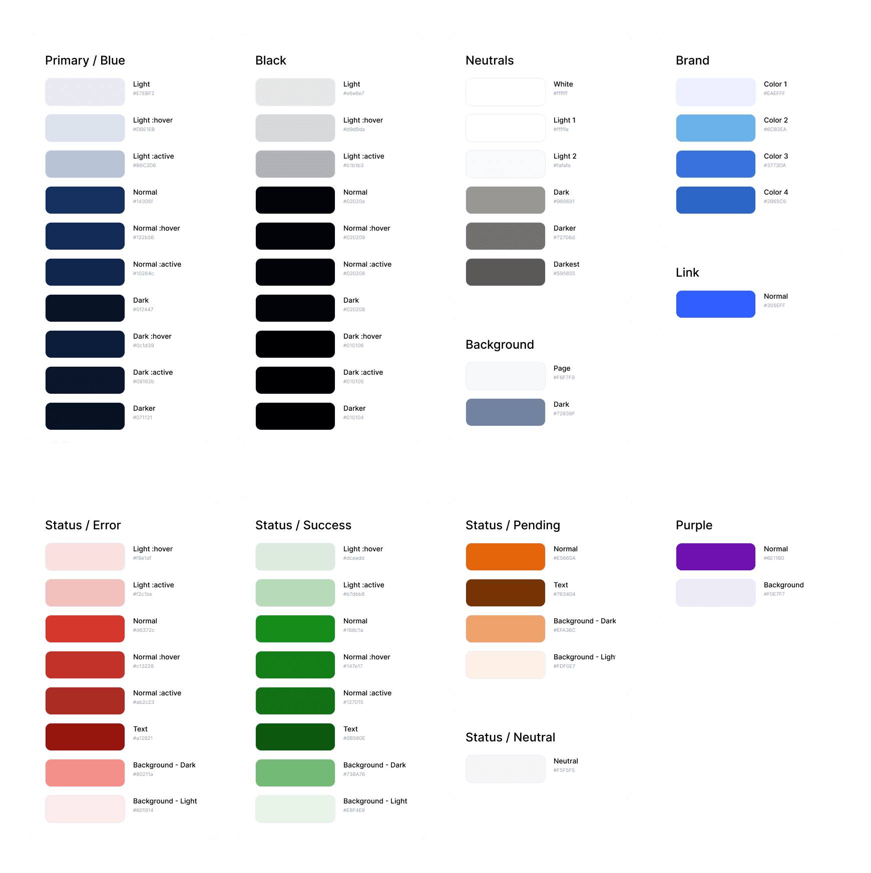
Visual alignment
Branding

Design system


Impact & value
Metrics
4.8/5
Average usability score
~10%
Operation error rate
240+
Pages of high-fidelity design
Feedback

From client
“Excellent work! A clearer MVP direction, helped my team align around core workflows, and turned a complex InCEP-inspired concept into a testable product experience.”

From users
“It made my tasks easier to start, review by giving more resourceful guidance, clearer status, and AI-support really helped me.”
Reflection
What I learned
Complex systems need clarity, not more features
In B2B flows, the best design often comes from helping users understand where they are, what matters, and what to do next.
Real-world UX is also scope management
A designer’s role is not only to create screens, but also to help teams prioritize, and move from ambiguity to execution.
AI should support judgment, not replace it
Users were open to AI insights, but they needed source context, reasoning, and control before trusting the output.
