Projects
ALGORITHM / Manage Topics
OVERVIEW
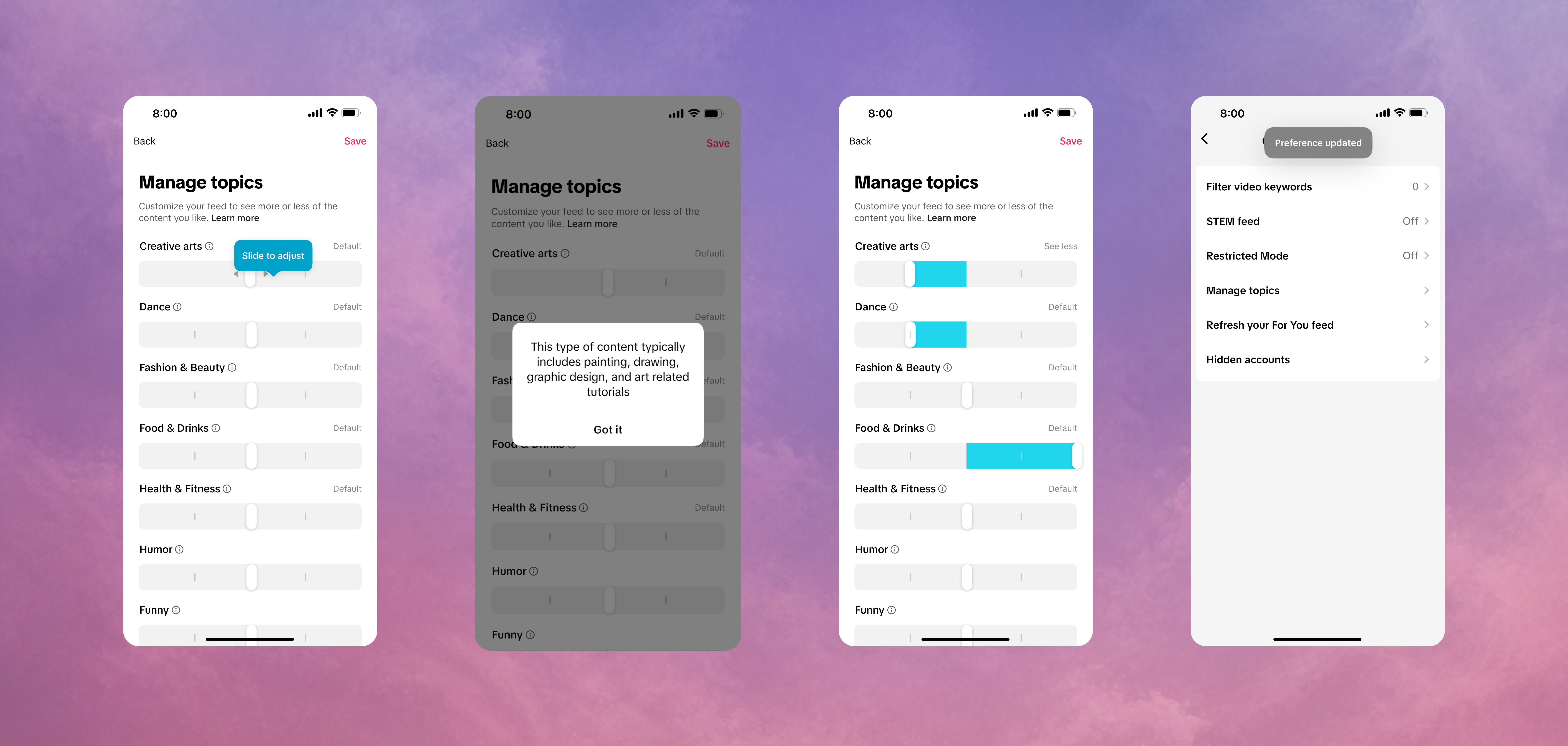
Manage Topics lets people adjust how strongly selected topics influence their For You feed. The feature was expected to reach 250K+ daily active users, but adoption remained below expectations based on research.
Product review and usability testing revealed a deeper challenge: because topic preferences operated alongside multiple signals, users could not reliably distinguish the effect of each level in the five-step control or tell whether their preference was influencing the feed.
My goal was to make the experience easier to understand, easier to use, and more visible after the user left the settings page.

MAJOR CHALLENGE
Through product review, the original experience had two connected problems:
False precision
The five-level slider technically represented different recommendation intensities, but those differences were difficult to perceive in the feed. It could also be mistaken as controlling the amount of content rather than the strength of a recommendation preference.
Invisible feedback loop
Once users saved a preference, they had little evidence that it was active or influencing their experience. Because multiple ranking signals shaped the feed, users could not reliably connect subsequent content back to their adjustment.
This led to the core question:
How might we help users express a clear preference, know when it is active, and understand how it affects their feed?
Design Strategy
Make the preference clear across the full experience
STEP1
Let users understand what the feature does and what control it provides
STEP 2
Users express a preference clearly without interpreting complex control
STEP 3
Users can tell the setting is active, recognize its effect in the feed
END-TO-END DESIGN EXPLORATION
Key Screen Design - Simplifying the control
The original slider suggested a level of precision that the recommendation system could not consistently deliver, explore how to simplify the control with clearer view. I compared interaction models against three criteria: semantic clarity, screen efficiency, and scalability across topics.

Selected Direction
Pro
Con
- Clear preference direction - Compact topic rows - Better for localization
- Less visually expressive

01 Segmented Control
Pro
Con
- All options stay visible - Clear current selection - Easy to compare states
- Shows fewer topics per screen - Controls overpower topic content

02

03

04

05
Other Screens
I explored the experience from setting preferences to recognizing and refining their impact in the feed, uncovering distinct opportunities and trade-offs across each direction.

SOLUTION
Match control precision to system precision
Make preference state visible
Close the feedback loop


DELIVERABLES

COMPLIANCE / Age Verification Flow
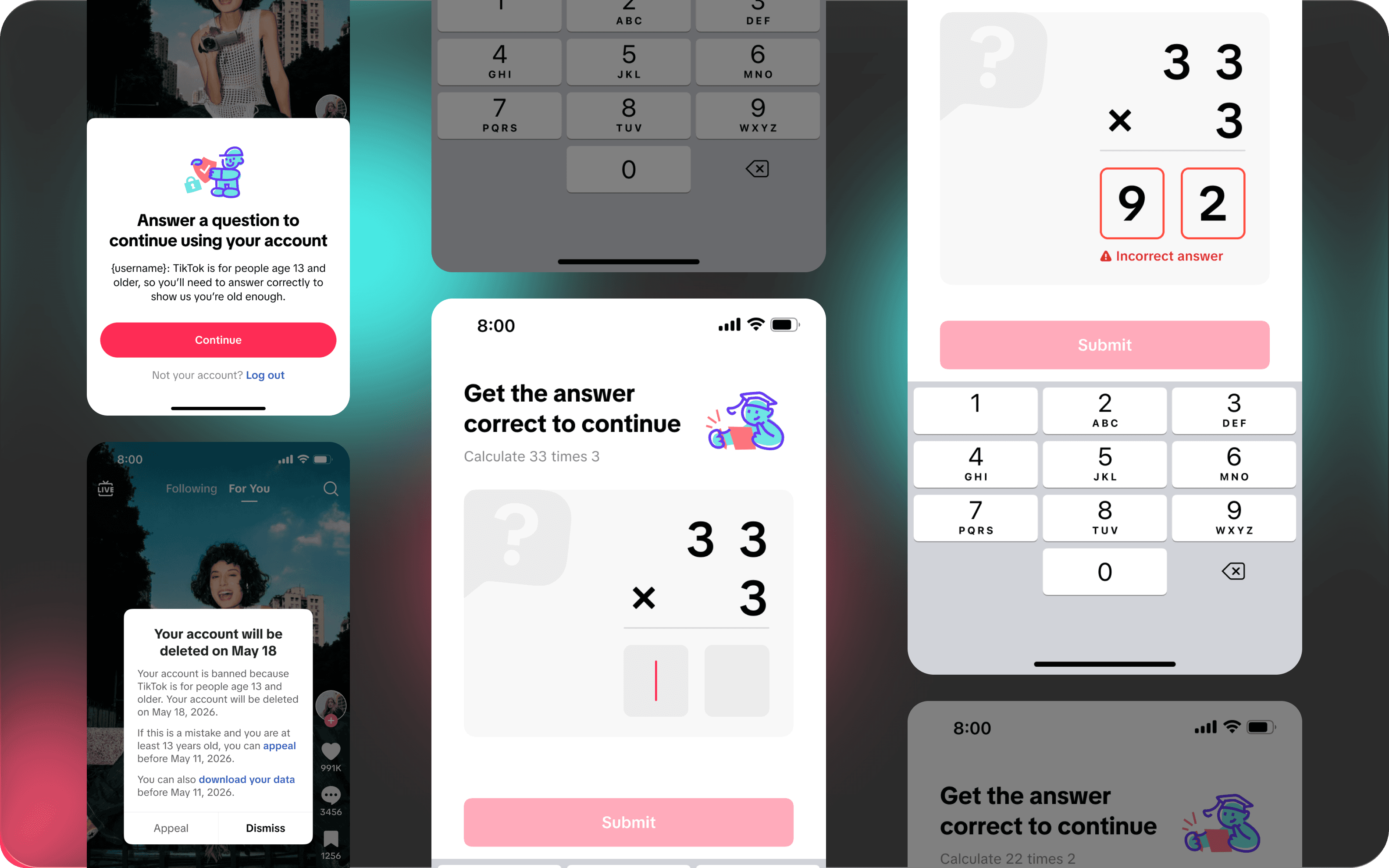
Age verification products require careful interpretation of complex compliance requirements.
CHALLENGE
Introduce additional verification for younger users without making the experience feel restrictive, while maintaining TikTok’s playful and approachable visual language.
SOLUTION
Meet strict regulatory requirements while creating a clear and low-friction verification experience for younger users?
APPROCHES

Reviewed and translated relevant compliance requirements into clear verification criteria.


Researched the local culture and cognitive abilities of user in
the age range.

An age-appropriate verification method that met compliance requirements.
DELIVERABLES

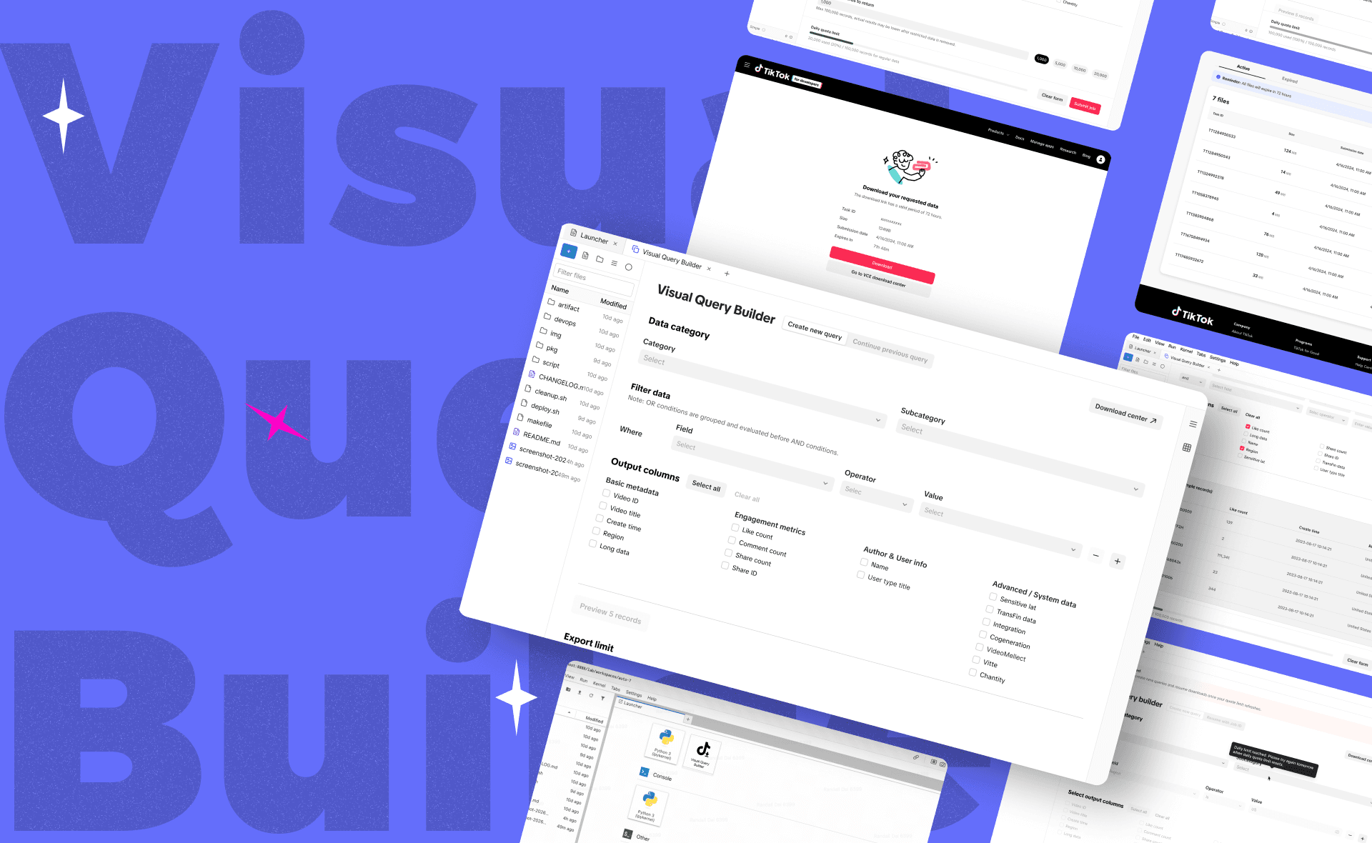
TOOL DESIGN / Data Tool for Researchers
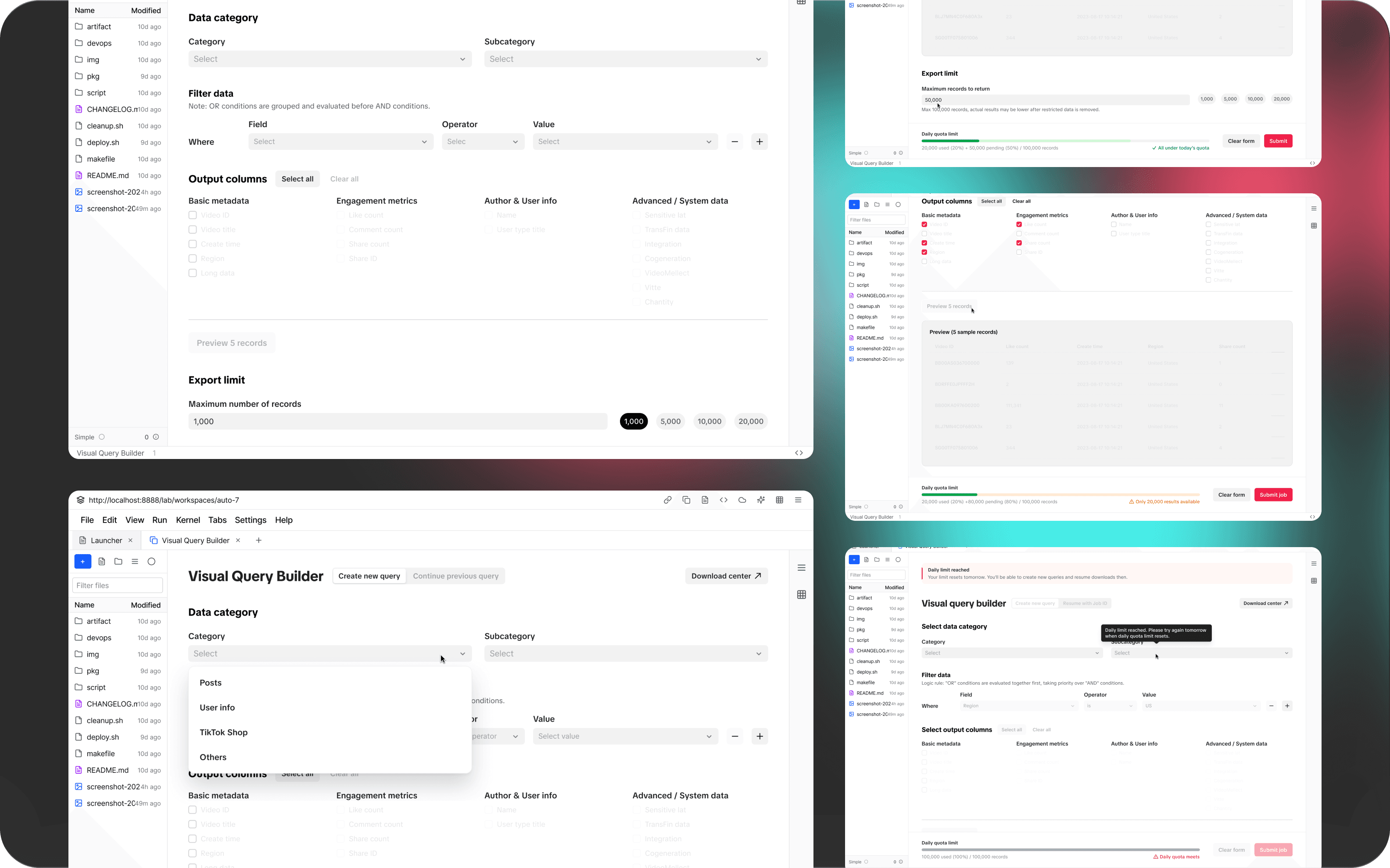
I designed a data access tool for external researchers to efficiently filter and retrieve TikTok data. I restructured the workflow to support pre-download filtering and guided query setup, enabling non-technical users to access relevant datasets without manual post-processing.
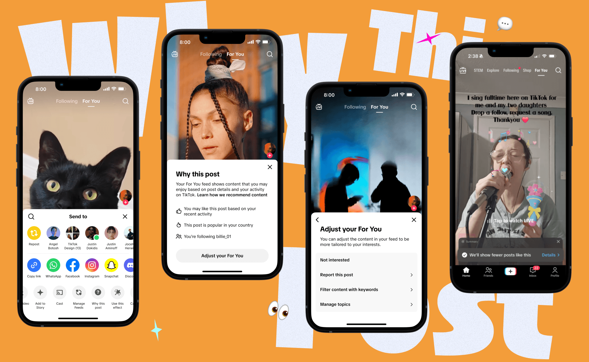
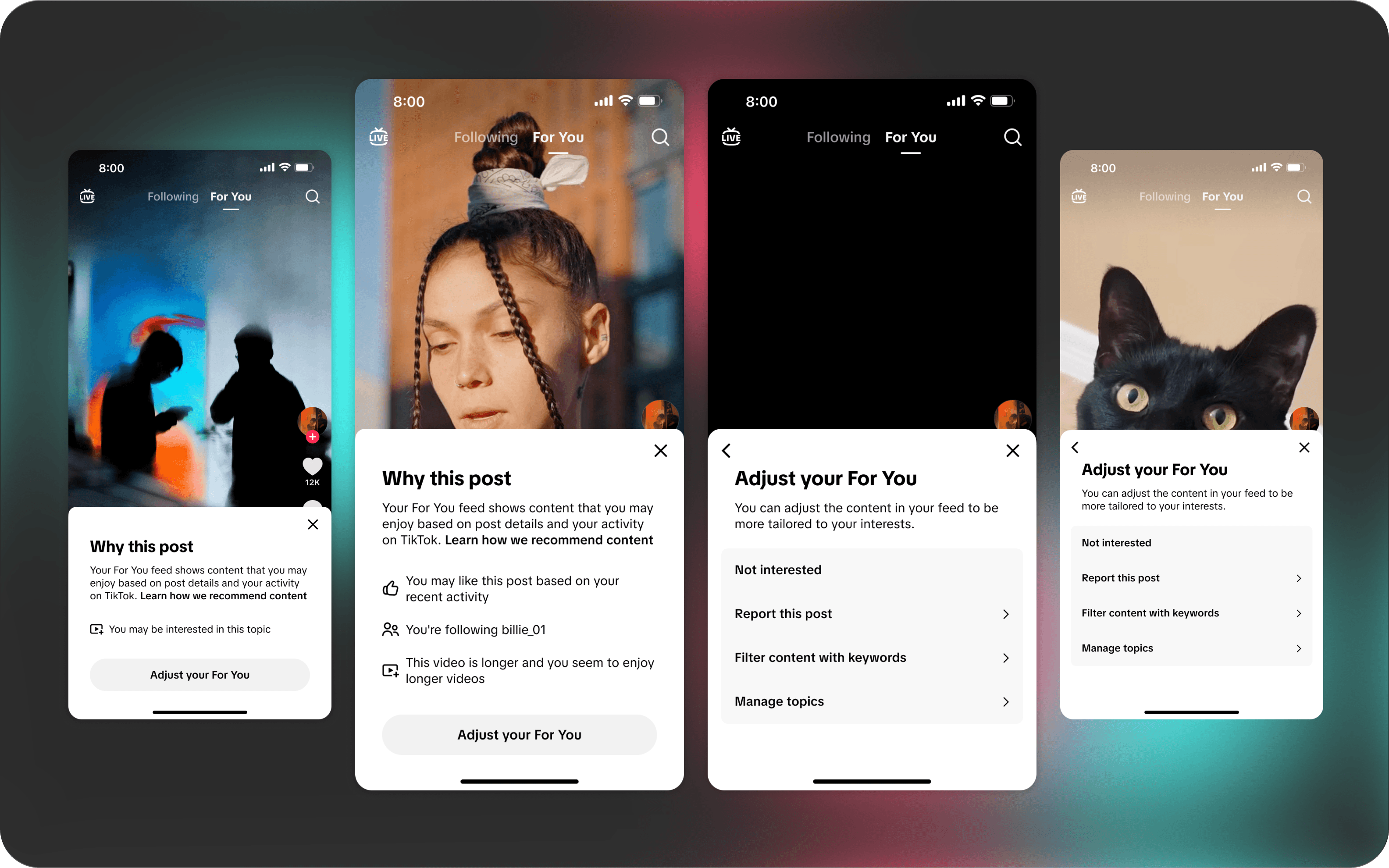
TRANSPARENCY / Why This Post
I redesigned the “Why this post” feature to make recommendation logic easier to understand and easier to act on. By connecting transparency with preference controls, I turned passive explanation into a more actionable, user-controlled experience for users
TikTok








Introduction
Collaborated across multiple product design workstreams within TikTok’s Content Ecosystem & Integrity team. I translated policy and platform constraints into clearer user experiences across compliance communication, recommendation transparency and control, and researcher tools.
Content Ecosystem & Integrity team
TEAM
ROLE
Designed interaction flows, information hierarchy, product states, and prototypes
Built a functional prototype with Figma and AI-assisted coding to support engineering evaluation
Partnered with product, engineering, research, and policy to clarify requirements, review tradeoffs, and refine buildable directions
DOMAIN
Trust & transparency · Compliance · Researcher tools