
0→1 AI product · Product design + build
Shopping
starts before
the search query.
Could AI make shopping feel less overwhelming?
I designed and built Mori to turn unfinished buying thoughts
into a visible decision brief.

Cameras not too technical
Gifts for my gf’s birthday
CLEAR · SIMPLE · CONTROLLABLE

something for rainy commutes
ROLE
Product designer & builder
SCOPE
Strategy → interaction → code
STATUS
Working product

HOW IT WORKS
A small camera for travel that handles low light, under $800
CASE OVERVIEW
Treat AI shopping as a
decision system, not just a chat feature.
01 / Need
People know their situation before they know the category.
“Something for my commute” is a real need, even when it is not yet a valid search query.
02 / Product idea
Make interpretation visible before making recommendations.
Mori turns a thought into editable selected priorities, then shows related matches with reasons.
03 / Turning point
When confidence is low, clarifying instead of pretending to know.
Remove the fallback that forced plausible recommendations into the wrong category. Preserves uncertainty through clarification.
04 / Current proof
Built the complete decision flow as a working product.
From recommendation logic to live-provider failures and honest empty states, the end-to-end experience is implemented.

COMPETITIVE LANDSCAPE
keeps your priorities
visible and editable
I reviewed 7 AI-assisted shopping and discovery products of their interactions. Most competed through richer product data and deeper purchase action, but none made the user's current decision model a persistent, editable surface.
Where Mori stands out
A qualitative rubric based on publicly described interaction models

The opportunity
The trust gap appears one step later: users cannot see what the AI assumed, which constraints it respected, or why a product made the cut.
unfinished thought
“I need something better for travel…”
hidden interpretation
confident answer
Recommend products
but can the system defend them?
The product should not ask users to trust the model. It should make the model’s interpretation easy to inspect and correct.
DESIGN & STRATEGY
Decision 01 · Product shape
Make the first step feel lighter than shopping.
The suggested direction behaved like comparison, history, and controls all competed for attention. I deliberately cut it back to one progressive loop.
Before
Feature-complete, thesis-obscured

Too many destinations before value
AI reasoning hidden behind controls
Felt like managing a plan, not forming one
After
One thought, one visible transformation

M
What are you trying to find?
Start with natural language or voice
Edit the brief before committing
Expand only as confidence grows
Every element earns its place by helping the user move from recognition to action.
Decision 02 · CLEAR information layer
Organize information in the order a decision happens.
01

See the product
Visual recognition comes before detailed evaluation.
02
$1,299
MATCH 4.5/5
Check basic fit
Match score and intro support a fast first-pass screen.
03
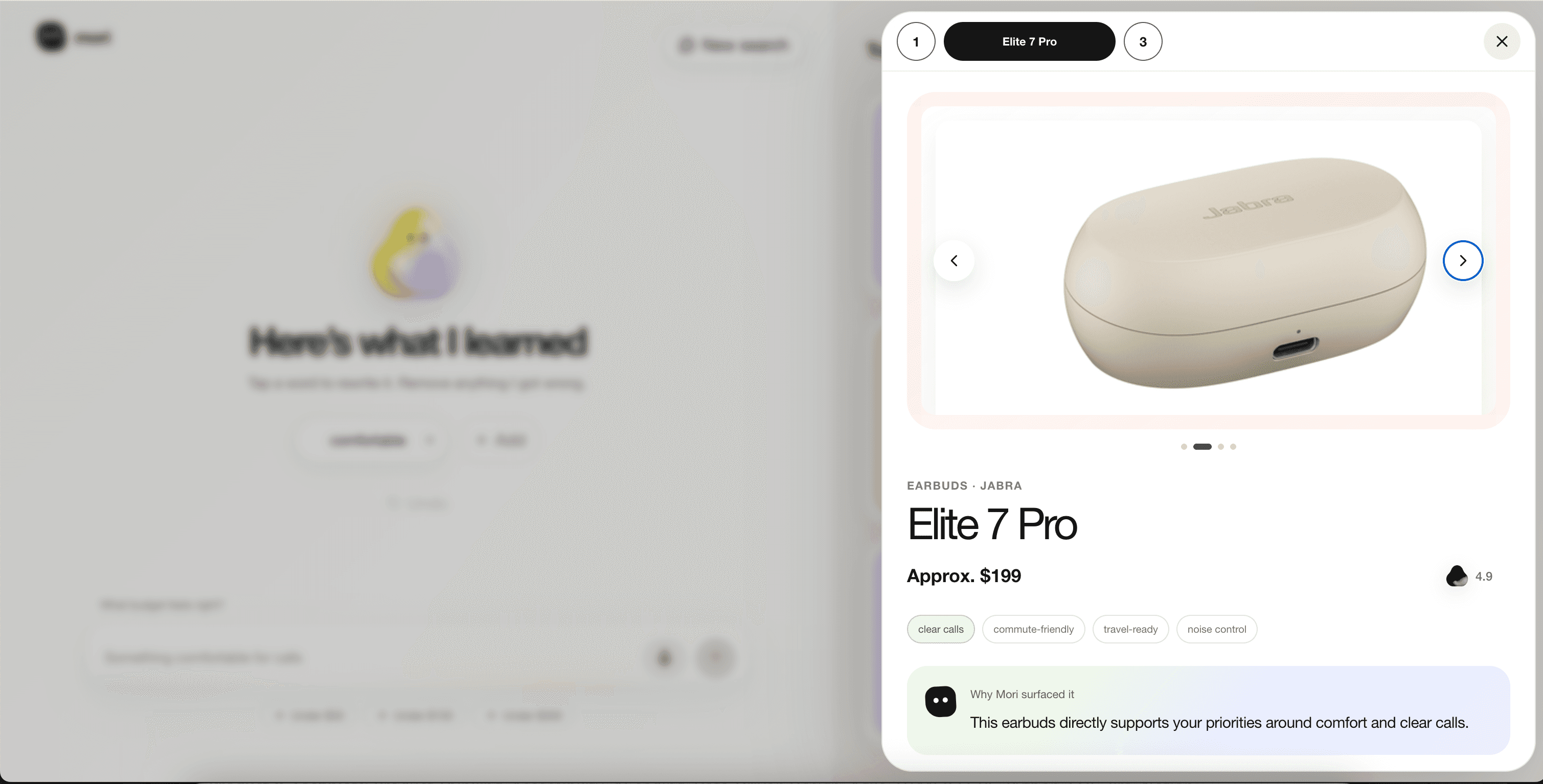
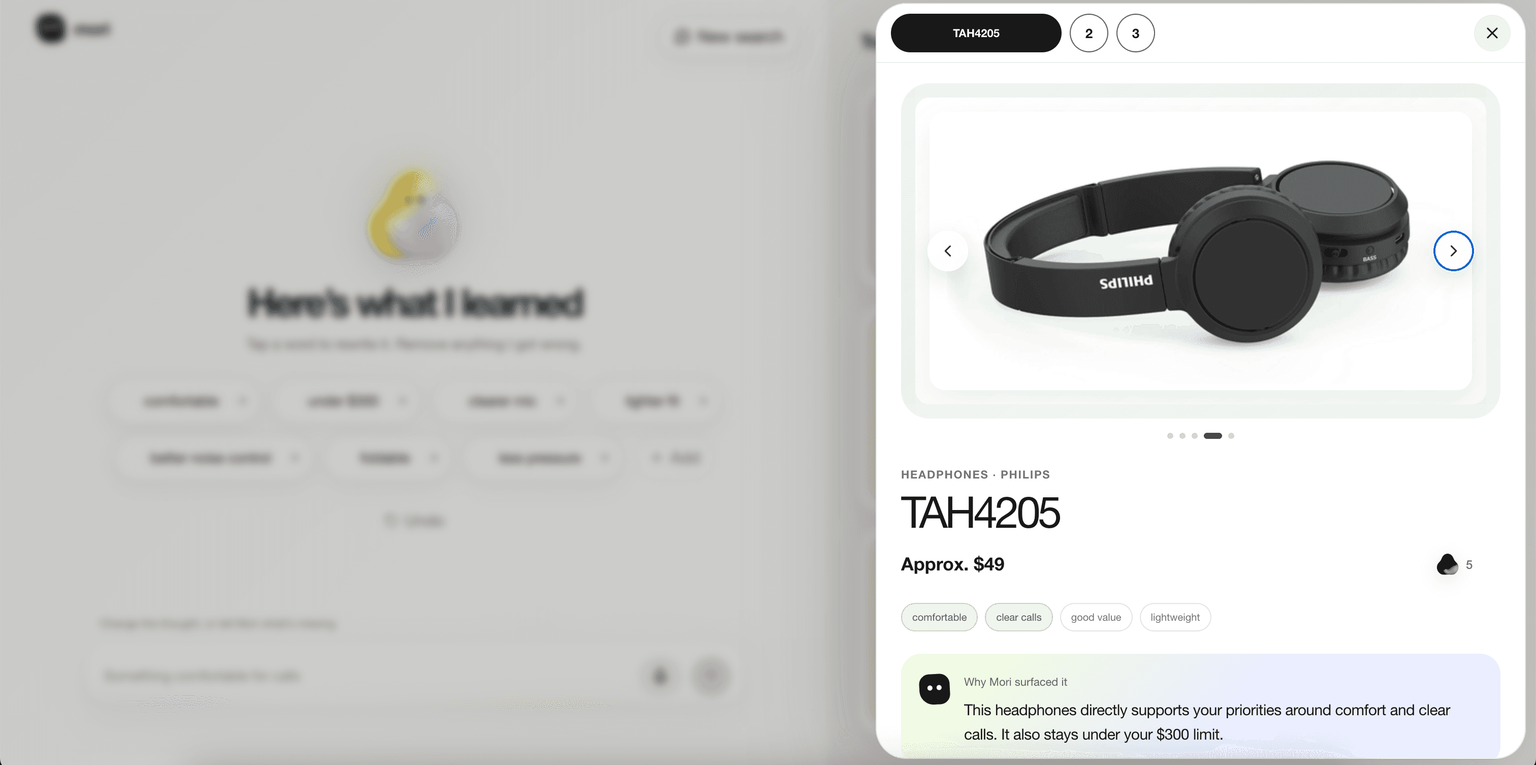
WHY IT FITS
“Compact frame and enough range for your weekend.”
Understand the reason
Explain why Mori chose it—not only that it was chosen.
04
Compare
Brand site
Local shop
One stage platform
Purchase channels turn a choice into an immediate next step.
Decision 03 · SIMplified interaction
Let users see and adjust what Mori understood.
A long AI response sounds confident but hides assumptions. I surfaced Mori’s interpretation as compact, editable keywords before showing products.
NATURAL INPUT
“I need something compact for a daily commute, but I still want enough range for the weekend.”
MORI UNDERSTOOD
✓ Assumptions become visible
✓ Corrections happen before recommendations
✓ Trust comes from control
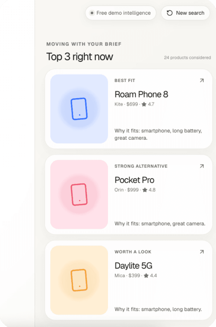
The original modal gave users no way to correct a poor fit. I added a reversible action so users could remove unwanted options, stay in control, and help Mori refine the shortlist around their preferences.
Decision 04 · Product shape
Let users shape the set, not restart it.


EVALUATION & ITERATION
Host usability testing of the product
Scenario-based evaluation exposed three failure patterns in the first flow. Turn them into helpful product decisions.


01
FOUND
Plausible answers could belong to the wrong category.
CHANGED
Visible interpretation and explicit category boundaries.
02
FOUND
Important constraints disappeared inside prose.
CHANGED
Editable priorities and structured hard constraints.
03
FOUND
Always returning results created false confidence.
CHANGED
Zero to three matches the system can actually defend.
FINAL & End-to-end ownership
Designing the product meant owning what happened beyond the screen.
I moved between product framing, interaction, data modeling, recommendation logic, provider integration, QA, deployment, and failure repair. The code was not the story; it made each product decision testable.




mori
AI Design & Build Product
·
2026
Request beta access
01
Frame
Turn an unfinished thought into a decision, not another search box.
02
Prototype
Make AI interpretation visible, editable, and reversible.
03
Evaluate
Stress-test category, constraint, negation, and fallback behavior.
04
Rebuild
Separate intent, retrieval, hard filters, and scoring into a traceable system.
05
Ship
Connect providers, resilient fallbacks, product details, and 42 automated checks.
Product surface
Next.js + TypeScript
Structured recommendation engine
Local deterministic fallback
Optional live providers

Reflection
Take a product from idea to something people could actually use.
Solving those gaps pushed me across product strategy, interaction design, coding, testing, and iteration. AI helped me move faster through each stage, but it did not replace my product judgment. I learned to use it as a building partner: explore quickly, test the result, and step in when the product was not good enough.
More Explorations


Mori · By Randall
Product design, interaction, systems, and build
Back to top ↑